
Loading Indicator
NativeScript Loading Indicator is a plugin that overlays a loading indicator on the current page. Can be used to prevent the UI being interacted with while data is being fetched from an API, while informing the user that something is happening.
Installation
bash
npm install @nstudio/nativescript-loading-indicatorScreenshots
iOS
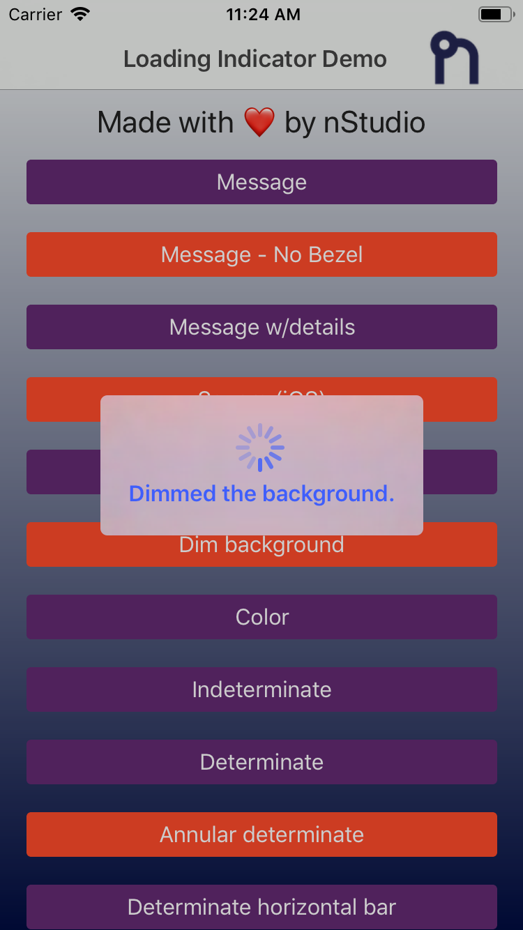 | 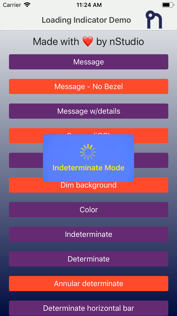 | 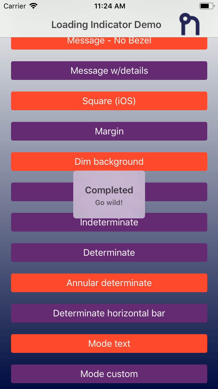 | 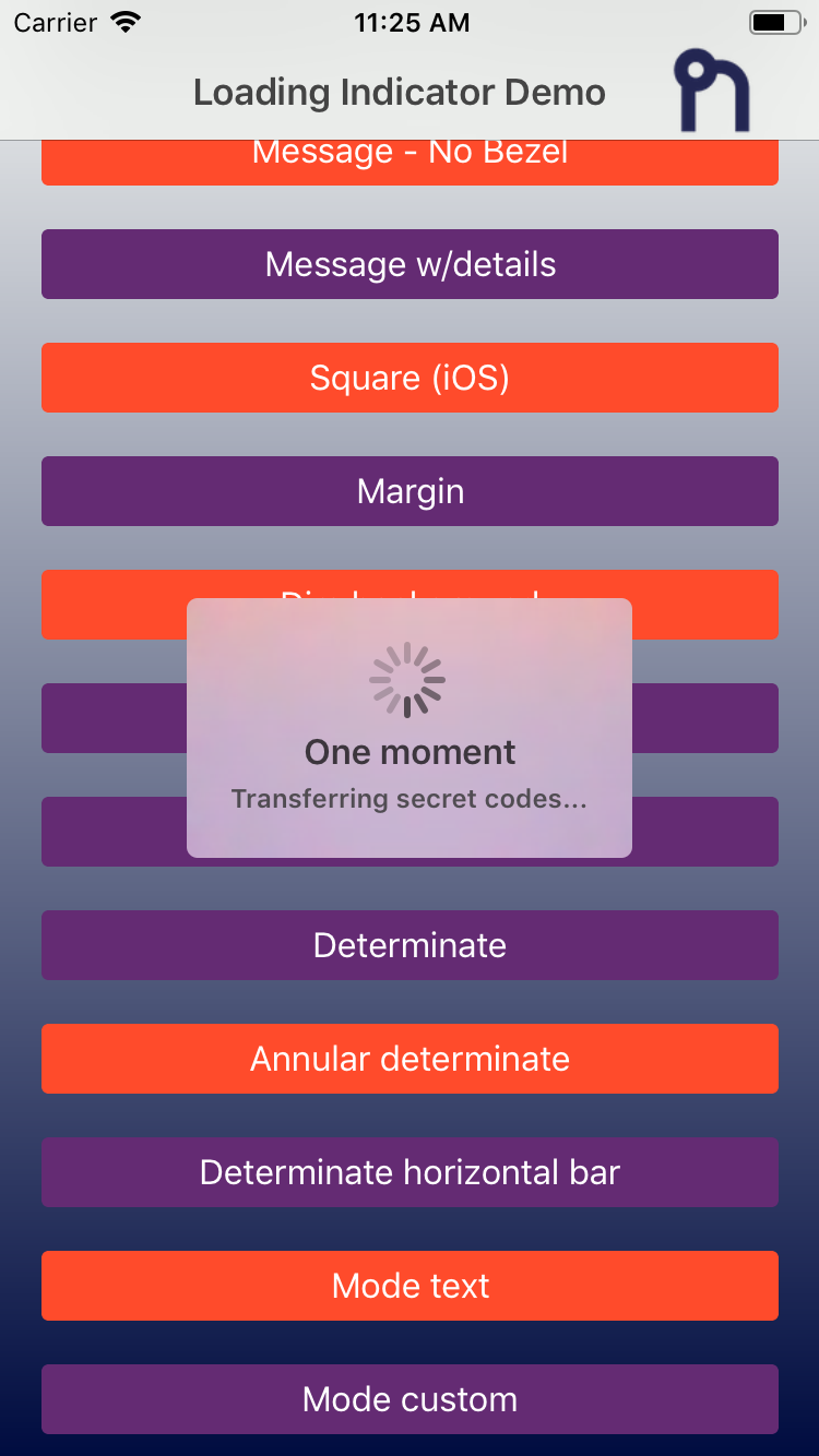 |
Android
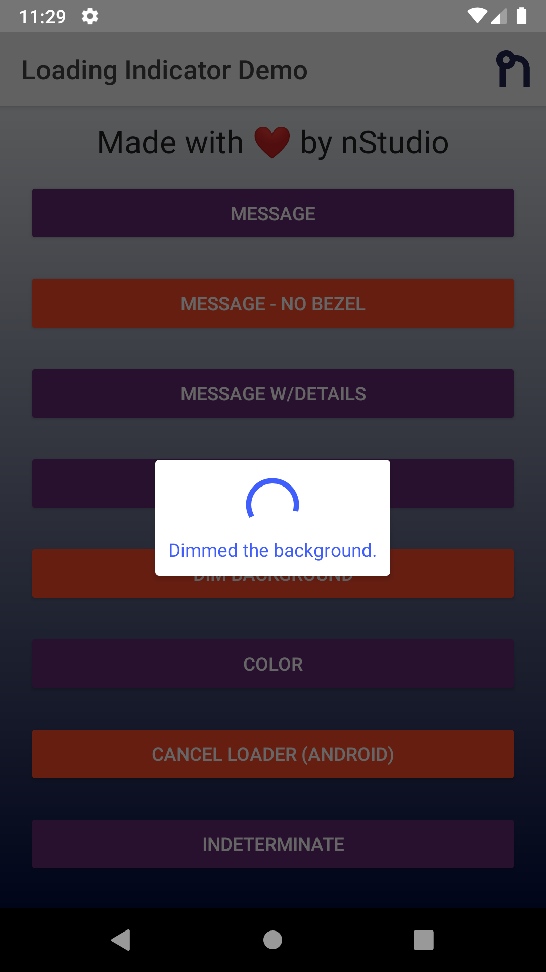 | 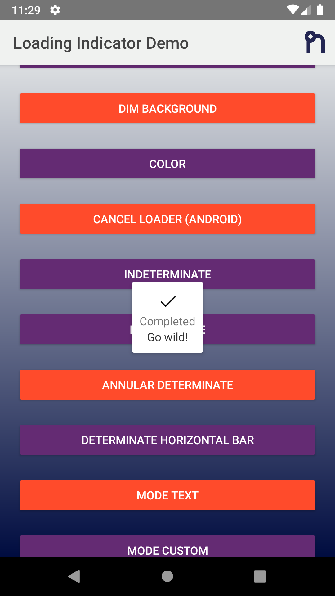 | 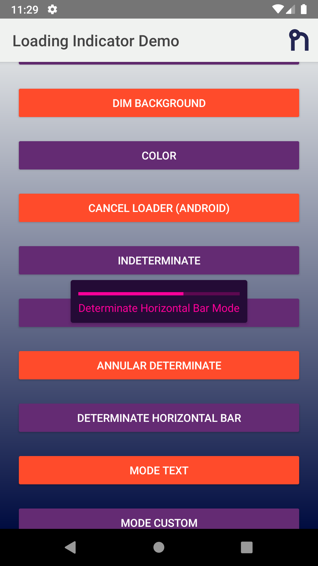 | 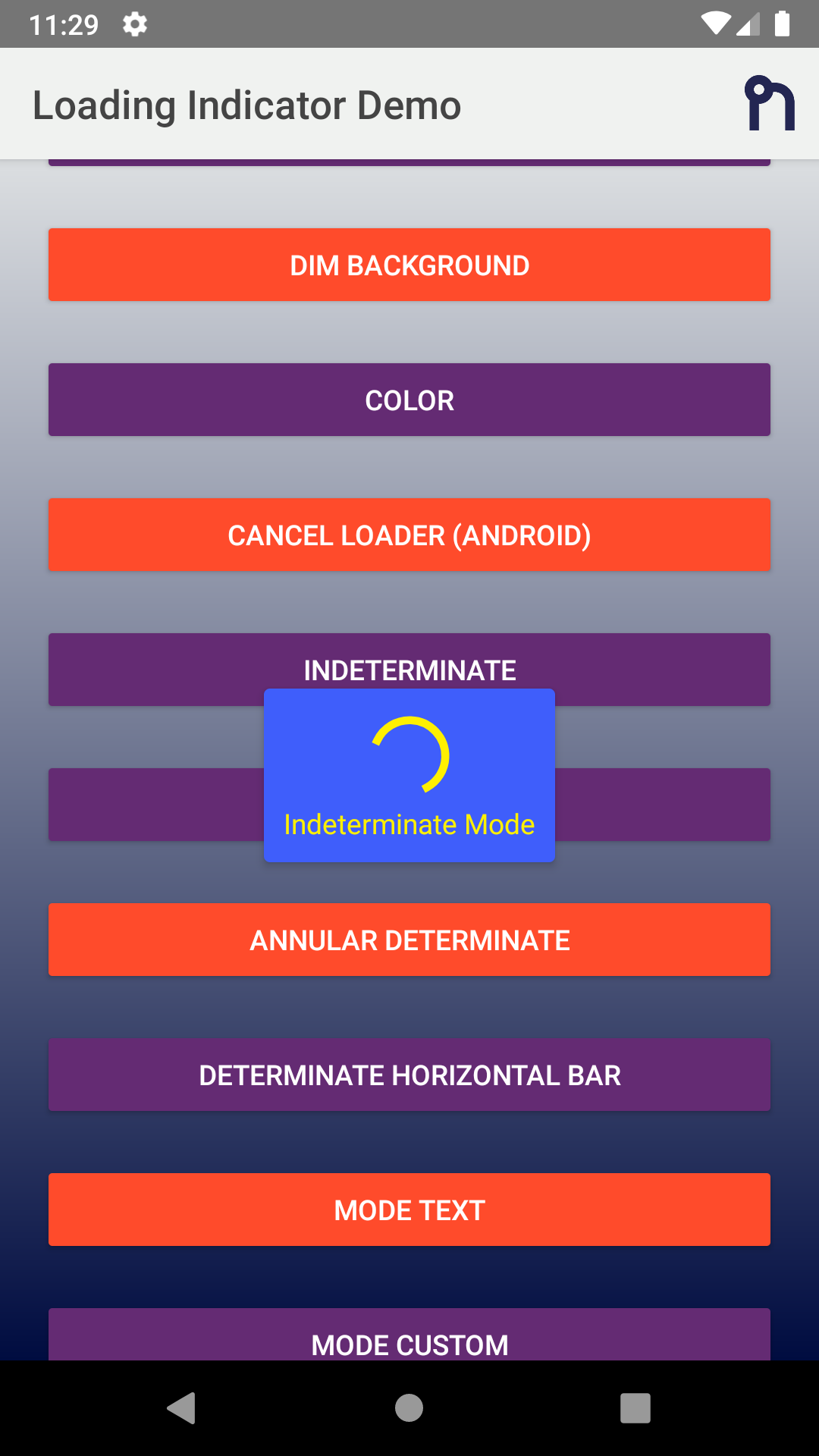 |
Usage
TypeScript
typescript
import {
  LoadingIndicator,
  Mode,
  OptionsCommon,
} from '@nstudio/nativescript-loading-indicator';

const indicator = new LoadingIndicator();

const options: OptionsCommon = {
  message: 'Loading...',
  details: 'Additional detail note!',
  progress: 0.65,
  margin: 10,
  dimBackground: true,
  color: '#4B9ED6',
  backgroundColor: 'yellow',
  userInteractionEnabled: false,
  hideBezel: true,
  mode: Mode.AnnularDeterminate,
  android: {
    view: someStackLayout.android,
    cancelable: true,
    cancelListener: function (dialog) {
      console.log('Loading cancelled');
    },
  },
  ios: {
    view: someButton.ios,
    square: false,
  },
};

indicator.show(options);

// After some async event, hide the indicator
indicator.hide();
JavaScript
js
const LoadingIndicator = require('@nstudio/nativescript-loading-indicator').LoadingIndicator;
const Mode = require('@nstudio/nativescript-loading-indicator').Mode;

const loader = new LoadingIndicator();

const options = {
  message: 'Loading...',
  details: 'Additional detail note!',
  progress: 0.65,
  margin: 10,
  dimBackground: true,
  color: '#4B9ED6',
  backgroundColor: 'yellow',
  userInteractionEnabled: false,
  hideBezel: true,
  mode: Mode.AnnularDeterminate,
};

loader.show(options);
loader.hide();
Options
| Property | Type | Description |
|---|---|---|
message | string | Message in the loading indicator |
details | string | Details message in the loading indicator |
color | string | Color of the message text |
backgroundColor | string | Background color of the loading indicator |
progress | number | Progress of the indicator (0-1) |
margin | number | Margin for the message/indicator to the edge |
userInteractionEnabled | boolean | Set true to allow user interaction |
dimBackground | boolean | Dim the background behind the indicator |
hideBezel | boolean | Hide bezel around indicator |
mode | Mode | The mode of the loading indicator |
Modes
Mode.Indeterminate- Default spinning indicatorMode.Determinate- Circular progress indicatorMode.DeterminateHorizontalBar- Horizontal progress barMode.AnnularDeterminate- Annular progress indicatorMode.CustomView- Custom view modeMode.Text- Text only mode
License
Apache License Version 2.0